
Once upon a time, my Elements in Blue Series was framed. That was about fifteen years ago. Some sold. Twelve didn't. At some point, the twelve were removed from their frames and shrink-wrapped. They sat in a print bin for several years ... until I had the opportunity to mount Blues Chapel at the Kershaw County Arts Center, a show that coordinated with a Blues Festival. That was in October. I blogged about it HERE.
For this solo show, I had to re-frame the twelve pieces. Thankfully, my husband Steve found a discontinued BLUE moulding. It was PERFECT. The show looked great ... but ... it's done now. Okay ... six of the piece were selected by curator Harriett Green for my show Behold the Wonder at Good Shepherd Episcopal Church in Sumter, South Carolina. I didn't even get a good picture of this grouping ... but ... they are there now. Unfortunately, that show will come to a close soon, February 13th.
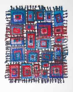
It became quite obvious that by mid-February, I'd have twelve blue frames holding much older work. I really don't need the older work framed. It makes more sense to simply shrink-wrap them again. It makes more sense to create newer work for the newer frames. So, last weekend I did just that!
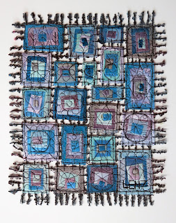
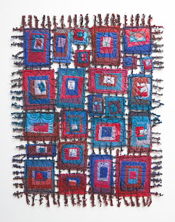
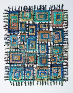
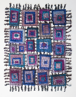
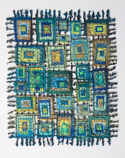
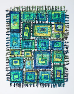
There was another, important reason for making this new work. It is all wrapped up in the creation of 145 In Box pieces for the Cambria Hotel that is currently under construction here in Columbia. Each guest room will have an original "Susan Lenz"! The pieces were created using the interior design's palette ... blue and orange. (I blogged about this HERE.) After making that many blue-and-orange pieces, I started seeing "orange" every time I see anything "blue". In my studio, "blue" just goes with "orange". The two colors have melded in my mind. Filling the blue frames with ANYTHING other than blue-and-orange was my exercise to eradicate the assumption that these two colors just had to go together.
Although blue and orange are complimentary colors according to color theory and every color wheel ever made, blue doesn't have to go with orange. Why not purple? Why not red? Why not yellow or green or silver and gold?
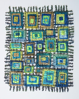
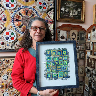
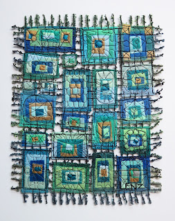
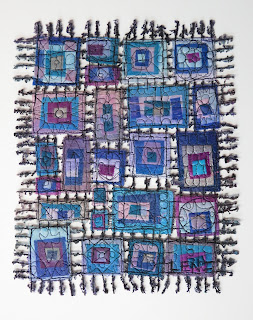
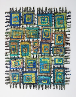
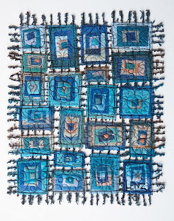
No two of these twelve pieces is exactly alike but each one started out with plenty of blue! It was great fun.
I worked on these pieces all weekend long. By Monday morning, I was in the garage melting them, happy that I was no longer seeing "orange" as the automatic response to anything blue. Then, I got an email from the arts consultancy company that commissioned the 145 blue-and-orange guest room pieces. They want five more ... for storage ... in case something breaks!
Hilariously, I am now making five more blue-and-orange pieces. I guess this is an excellent example of "the best laid plans"! LOL! The plan worked ... but not for long! Perhaps I'll just have to make more blue-and-anything-else pieces next week!
No comments:
Post a Comment